· 8 min read · Shabir Khan
UI/UX design in the AI era: tips, tricks and a cheat sheet
An AI model can draw a screen in ten seconds now. That is the problem. When anyone can generate a dashboard, the dashboard stops being the work. The work is knowing which screen is right, and writing it down so the next one comes out right on its own.
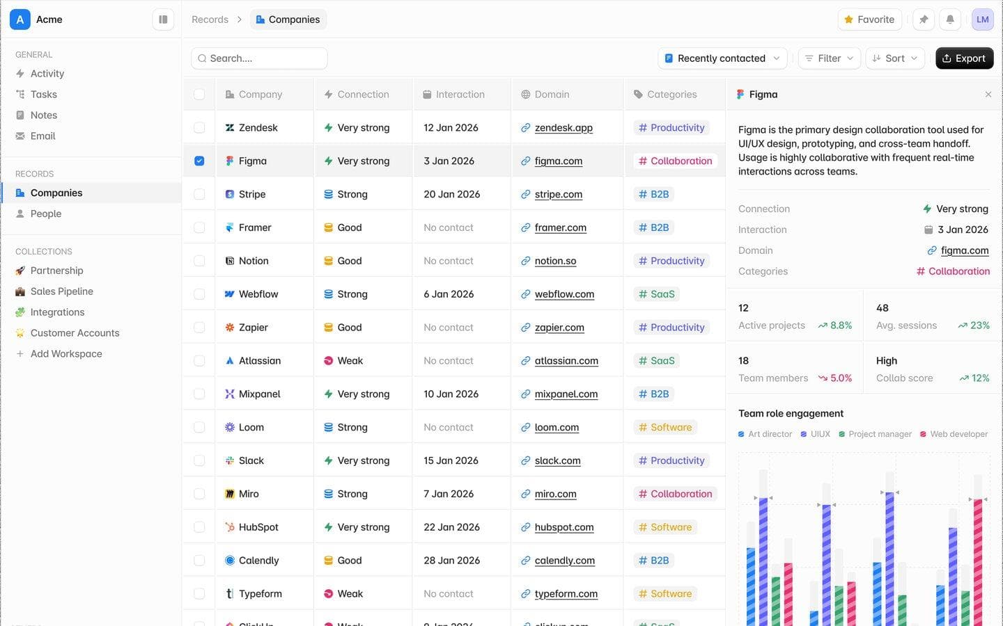
I design everything at RabtX with AI in the loop: Grid, School OS and designs like the CRM on the cover. This is what I have learned doing it, the tips and tricks that make it work, real screens, and a cheat sheet of the numbers I actually build with.
What actually changed
Production got cheap. Judgement did not. A designer used to spend most of a day pushing pixels and a little of it deciding; now the ratio flips. I spend my time on the brief, the system and the review, and the agent spends its time on the pixels.
That shift rewards a different kind of designer: one who can say precisely what good looks like, in words and numbers a machine can follow, and who can spot the one wrong state in a screen that otherwise looks finished.
The skills that still matter
Taste, made explicit. Having taste is not enough any more; you have to be able to write it down. "Calmer" is not a rule. "Secondary text at 55% ink, one accent colour, no shadows on inline cards" is.
Systems thinking. Agents are excellent at repeating a pattern and terrible at inventing a consistent one. Your leverage is the system: tokens, a radius ladder, a type scale, a component kit. Design the system once and every generated screen inherits it.
Writing. Briefs are the new wireframes. The clearest writer on the team ships the best UI.
State design. Loading, empty, error, disabled, focus-visible, selected, saving, success, permission denied. That list is the difference between a demo and a product, and it is exactly what generated UI leaves out.
Critical review. Before anything ships I ask four questions:
- Does the most important thing on the screen carry the most ink?
- Is every colour on the screen carrying meaning?
- What does this look like with no data, with an error, at 320px, in dark mode?
- Can I reach every action with a thumb and with a keyboard?
12 tips for designing with AI
- Write the design system down before you prompt. An agent can only follow rules it can read. Grid keeps one brief,
DESIGN.md, that every tool loads first: the material, the type scale, the radius ladder and the states each surface owes. One page of rules beats a hundred prompts that each re-explain taste. - Give numbers, not adjectives. "Clean and modern" gets you the average of the internet. "32px buttons, 10px radius, 13px medium labels, #777777 for secondary text" gets you your product. The cheat sheet below is exactly that.
- Design the states first, not last. AI draws the happy path by default. Ask for empty, loading, error, offline and permission denied by name in the first prompt, and review them before the populated screen.
- Two colours make everything. Grid's whole UI is a canvas and one ink. Borders, hovers, selection and secondary text are that ink at fixed strengths, so there is no grey palette for a model to improvise with. Fewer choices means fewer wrong ones.
- Build hierarchy with ink, not size. Most text is secondary. Only the user's data and the active state get full contrast; chrome recedes. When everything is bold nothing is, and agents love making everything bold.
- Colour is a signal, never decoration. Accent means focus, active or link. Green, amber and red appear only when they mean something, as text or a 10% fill. If you can delete a colour and lose no information, delete it.
- Mobile first, in one component. Unprefixed classes are the phone layout;
sm:andlg:add the desktop on top. Tell the agent this or it will write desktop first and patch phones back down. - Keep touch targets honest. A control can look 24px and still be 44px to a thumb. Draw it small, give it a big hit area, and never hide an action behind hover alone.
- Quiet motion. Short, ease-out, colour-only on hover, a 0.97 scale on press. Motion should confirm what happened, not perform. Generated UI over-animates; cut it in review.
- Review in both themes, at 320px. Every Grid screen is drawn four times: desktop and phone, light and dark. Most AI bugs show up in exactly one of the four: a hard-coded white, a label that wraps, a row that overflows.
- Keyboard and screen reader are part of the design. Focus rings, labels on icon buttons and real
role="switch"semantics are cheap to ask for and expensive to retrofit. Put them in the brief. - Let tests guard your taste. Grid's console fails the build on a font size outside the scale, a one-off duration or a fixed corner radius. Taste enforced by a test survives a hundred agent commits; taste that lives in a reviewer's head does not.
How I design with AI
Grid is designed in Figma first, in the RabtX design system file, and built by agents from those frames. The file holds every product area as its own section (Home, Inbox, Threads, Composer, Board, Files, Terminals, Ship, Settings and more), and every screen exists four times: desktop at 1440 and phone at 390, light and dark. A separate States page draws the frames AI forgets: an empty inbox, a board that is reconnecting, a thread whose run failed, notes that are still loading.
The loop has four steps:
- Brief. One paragraph on what the screen is for and who uses it, plus the rules from
DESIGN.md. - Figma frames. The screen in the design system, at both sizes and in both themes, with its states.
- Agent builds. The agent reads the frame through the Figma MCP server and assembles it from the product's own component kit, never fresh markup.
- Screenshot review. Real screenshots in both themes and both sizes, compared against the frame, before anything merges.
The trick is that the agent never starts from a blank file. Its job is composition, not invention, and composition is the part models are genuinely good at.
The showcase
These are real screens from products I have designed this way.
Grid
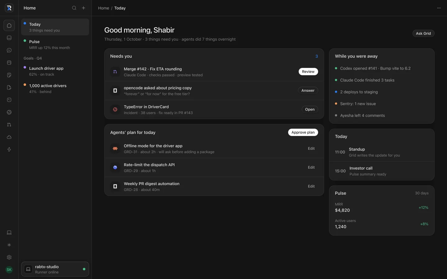 Grid home. Chrome sits at low ink so the work leads, and every item that needs you has exactly one action next to it.
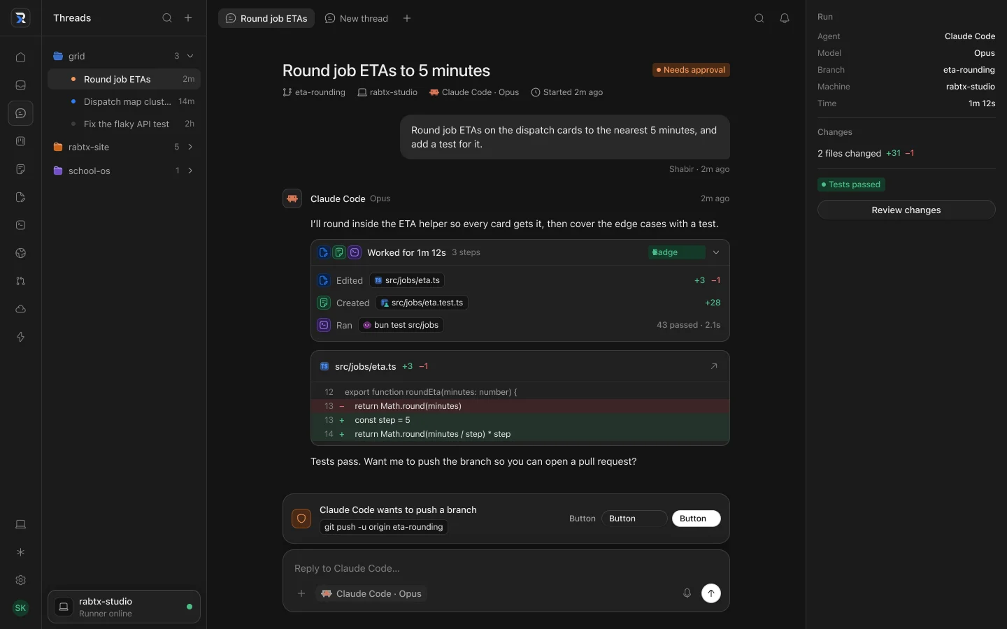 An agent thread. Every command the agent wants to run is a card you approve, and the run's agent, model and machine sit quietly on the right.
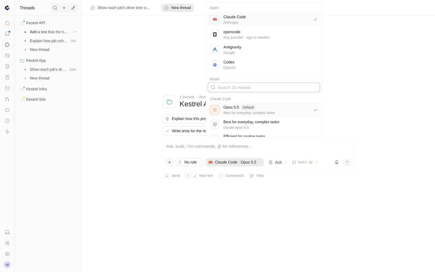 The agent and model picker. Provider-agnostic by design: every agent and model in one list.
School OS
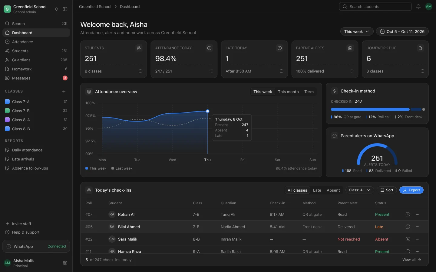 The School OS dashboard. Five stat tiles, one chart, one table, and colour only where it means something: present, late, absent.
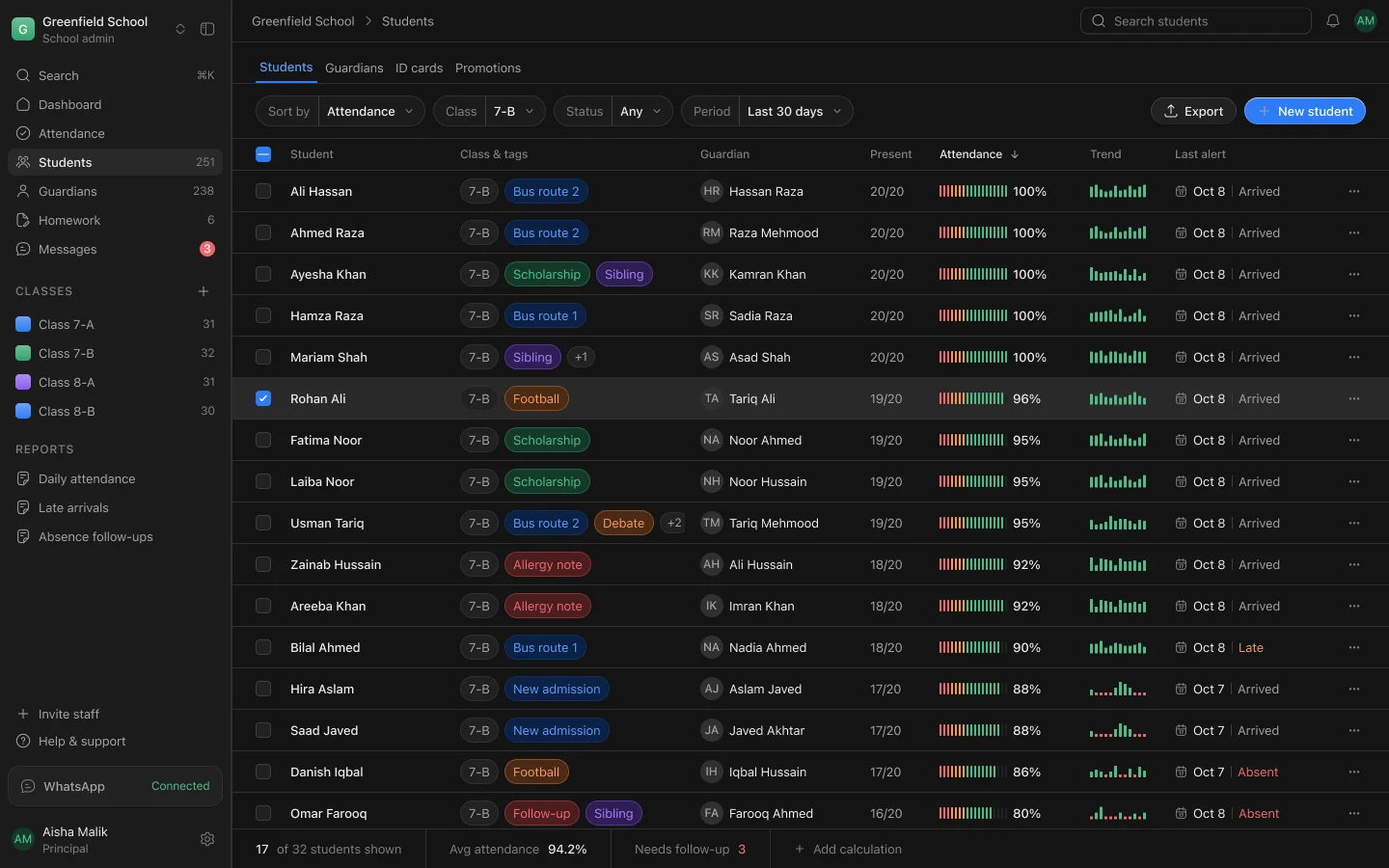 Students. Dense rows that still scan: tags carry the context, the attendance bar and trend carry the numbers.
A CRM workspace
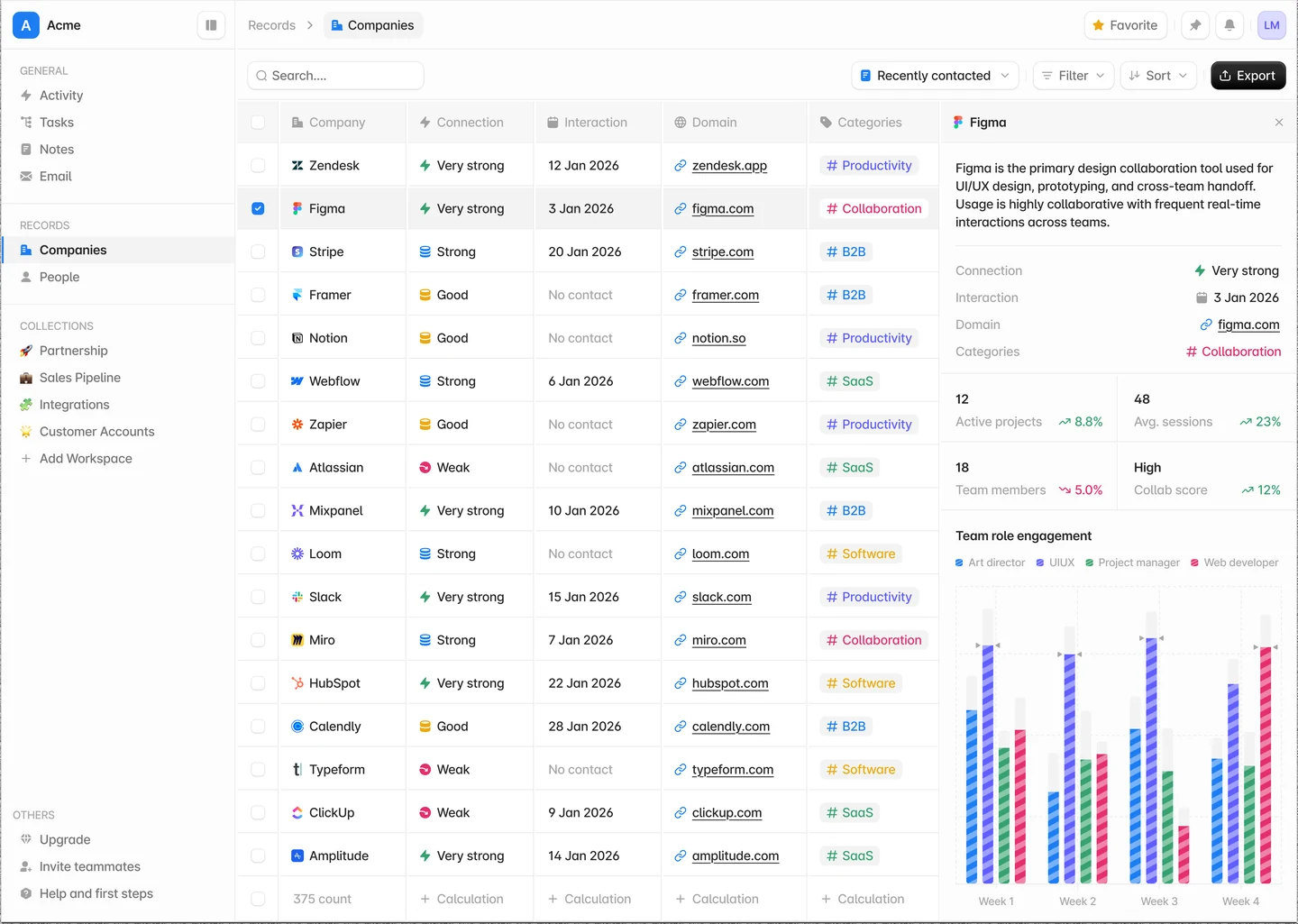 Companies. Connection strength reads as an icon and a colour together, categories are tinted hash chips, and the detail panel pairs four stat tiles with a weekly engagement chart.
What to notice across all three:
- Strong states. Very strong, Strong, Good and Weak each get their own icon and colour, so the column scans without reading a word.
- Empty data is designed too. "No contact" sits in subtle text instead of a blank cell.
- One row height, one radius, one icon size, from the sidebar to the table footer.
- No cards inside cards. Surfaces stay flat until something genuinely floats.
Apps design UI cheat sheet (bookmark this)
| Part | Spec |
|---|---|
| Type | Inter, 16/20px Medium titles, 13/16px Medium labels, 14px Regular body |
| Buttons | 32px height, 10px radius |
| Rows | 40px data, 44px stores |
| Badge | 20px height, 6px radius, #CAFACE fill, #15B042 text |
| Switch | 24×14px, 10px thumb, #0077E6 track |
| Text | #333333 default, #777777 subtle |
Strong states make settings easier to scan.
The sheet is also the fastest prompt I know. Paste it into your agent's context as is and every button it draws will match the last one:
Type:    Inter. Titles 16/20px Medium. Labels 13/16px Medium. Body 14px Regular.
Buttons: 32px tall, 10px radius.
Rows:    40px for data rows, 44px for store rows.
Badge:   20px tall, 6px radius, fill #CAFACE, text #15B042.
Switch:  24x14px track, 10px thumb, on-track #0077E6, 44px hit area.
Text:    #333333 default, #777777 subtle. No other greys.
States:  design empty, loading, error and disabled for every surface.
Use it as a starting point, not a law. The value is not these particular numbers; it is having numbers at all.
Icons: Hugeicons, one stroke
Mixed icon sets are the fastest way to make a generated UI look generated. Grid uses Hugeicons everywhere, at a 1.5 stroke, 16px beside labels and 20px on their own, and icons at rest sit at the same muted ink as the labels next to them.
Tell your agent the family, the stroke and the size in the brief, and name the icon when it matters. A model left to choose will reach for whatever set it saw most in training.
The takeaway
AI did not make design less important; it made the parts of design that cannot be generated the whole job. Write your system down, give numbers instead of adjectives, design the states first, and review every screen in both themes at the smallest width. The agents will handle the pixels.